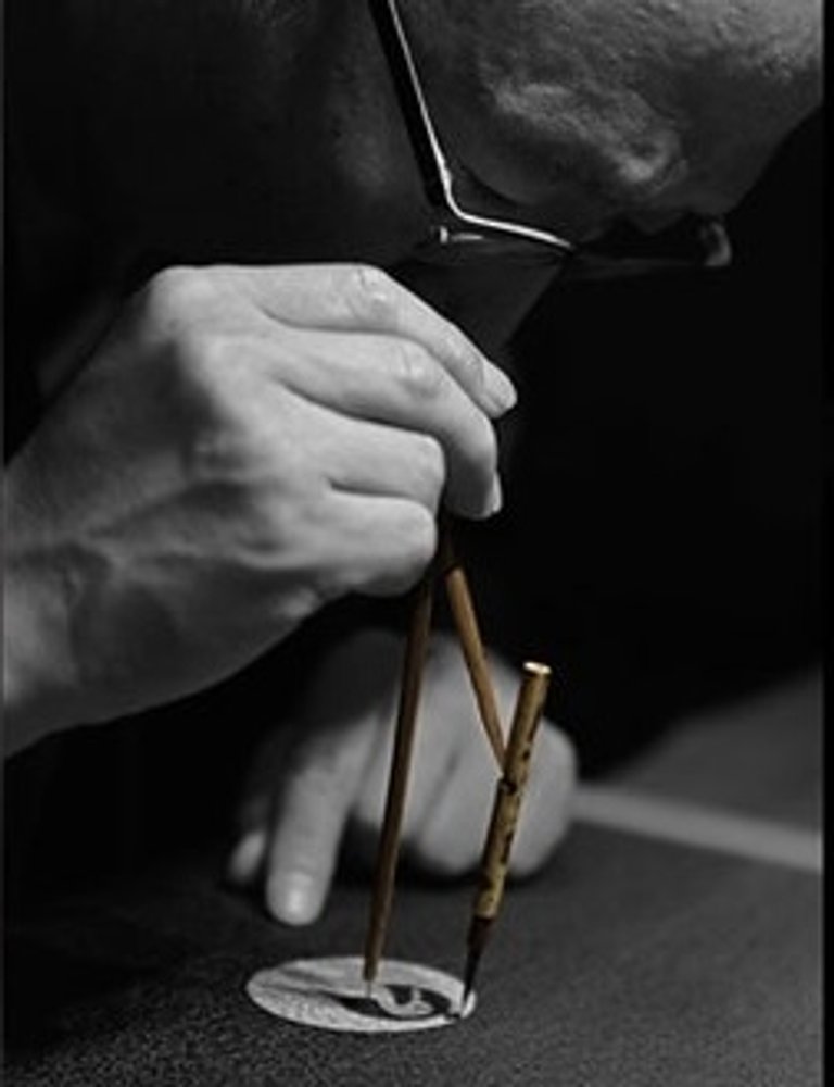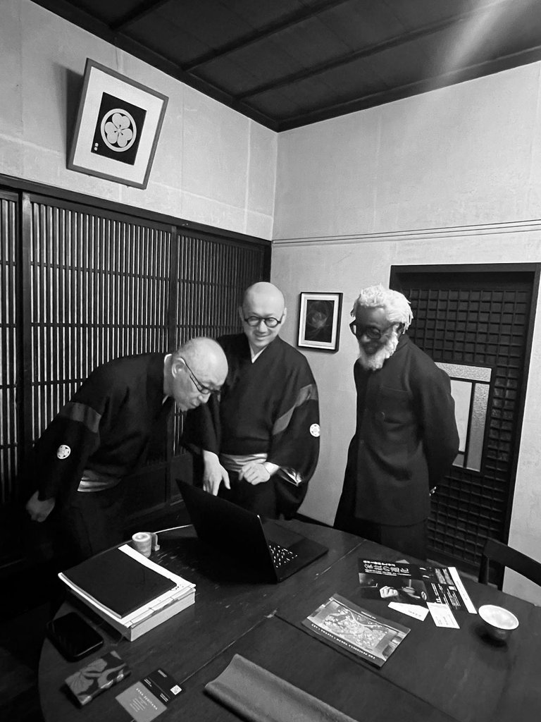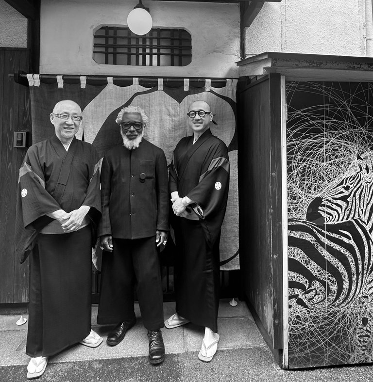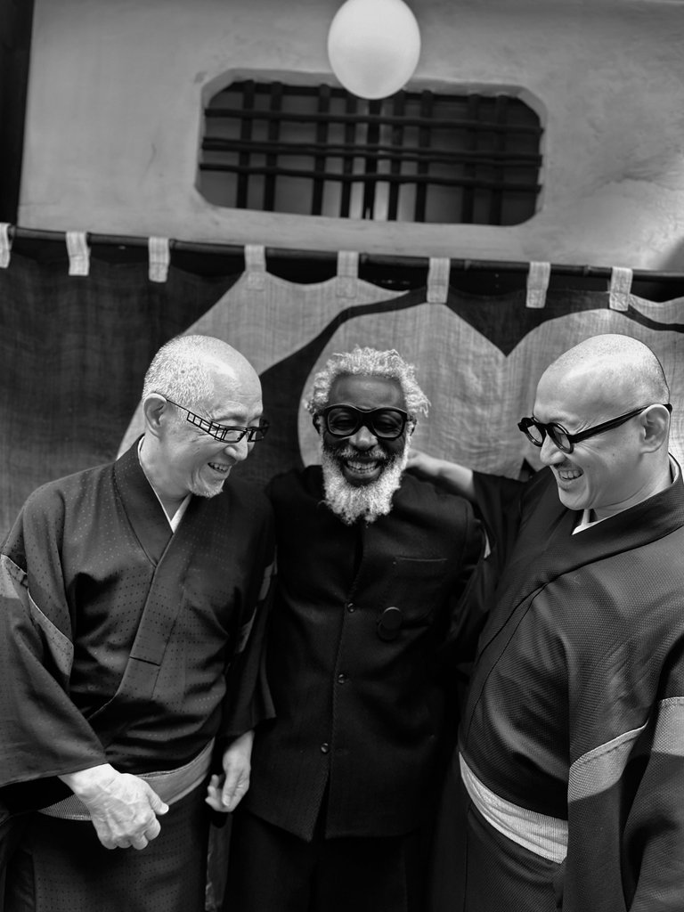
The cool Hatobas, Shoryu Hatoba and his son Yoho Hatoba are third and fourth generation Japanese family crest designers known as Monsho Uwaeshi.
Monsho-uwae refers to the technique of hand-painting Kamon on kimono, and Monsho-uwaeshi is an artisan who performs it. Drawing Kamon takes seemingly simple tools – a ruler and bamboo compass with a superfine brush attached to it.
Kamon solely consists of perfect circles and straight lines. Even intricate curved lines are drawn by skillfully connecting large and small perfect circles using Bun-mawashi, a compass made of bamboo that is one of the essential tools for Monsho-uwaeshi.
The Origin of Kamon
Japanese crests are called mon (紋, crest) or kamon (家紋, family crest). Inspired by nature, they emerged during the Heian period in the late 11th century as a visual shorthand for identity and artistry. Aristocrats used them on ox-drawn carriages to indicate ownership, rank and right of passage. By the Kamakura period (1185–1333), samurai clans adopted kamon in battle to distinguish friend from foe.
The Kamon has approximately 1000 years of history since the Heian period and it is said that there are as many as 50,000 distinctive designs of Kamon today.
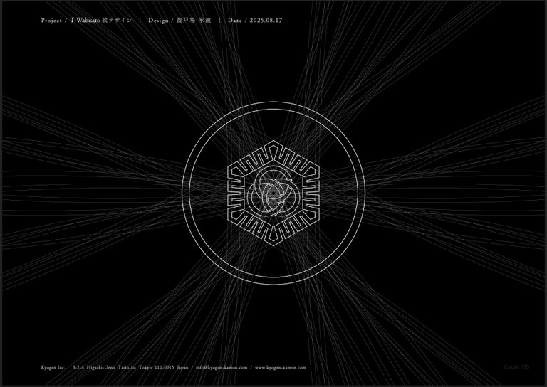
MON-MANDALA®
MON-MANDALA® represents a unique technique developed by Shoryu Hatoba as well as his artwork, where the “traces of circles and lines” are intentionally visualized unlike traditional methods of drawing Kamon. In this technique, Kamon is sublimated to a form of art, creating a distinctive worldview with curved lines that are produced through years of Shoryu’s experience as a Monsho-uwaeshi. Not to mention Kamon, absolutely everything in the universe can be expressed by integrating countless circles. The term MON-MANDALA® is derived from the word “Mandala” in Sanskrit, meaning “circle.”
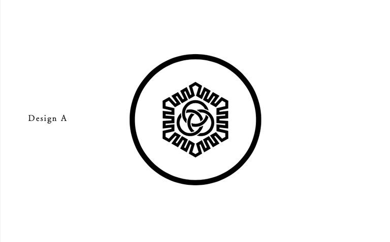
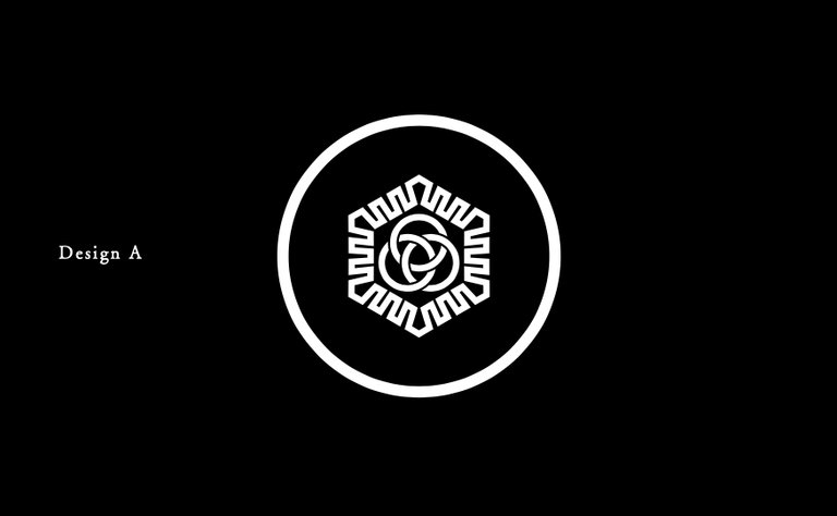
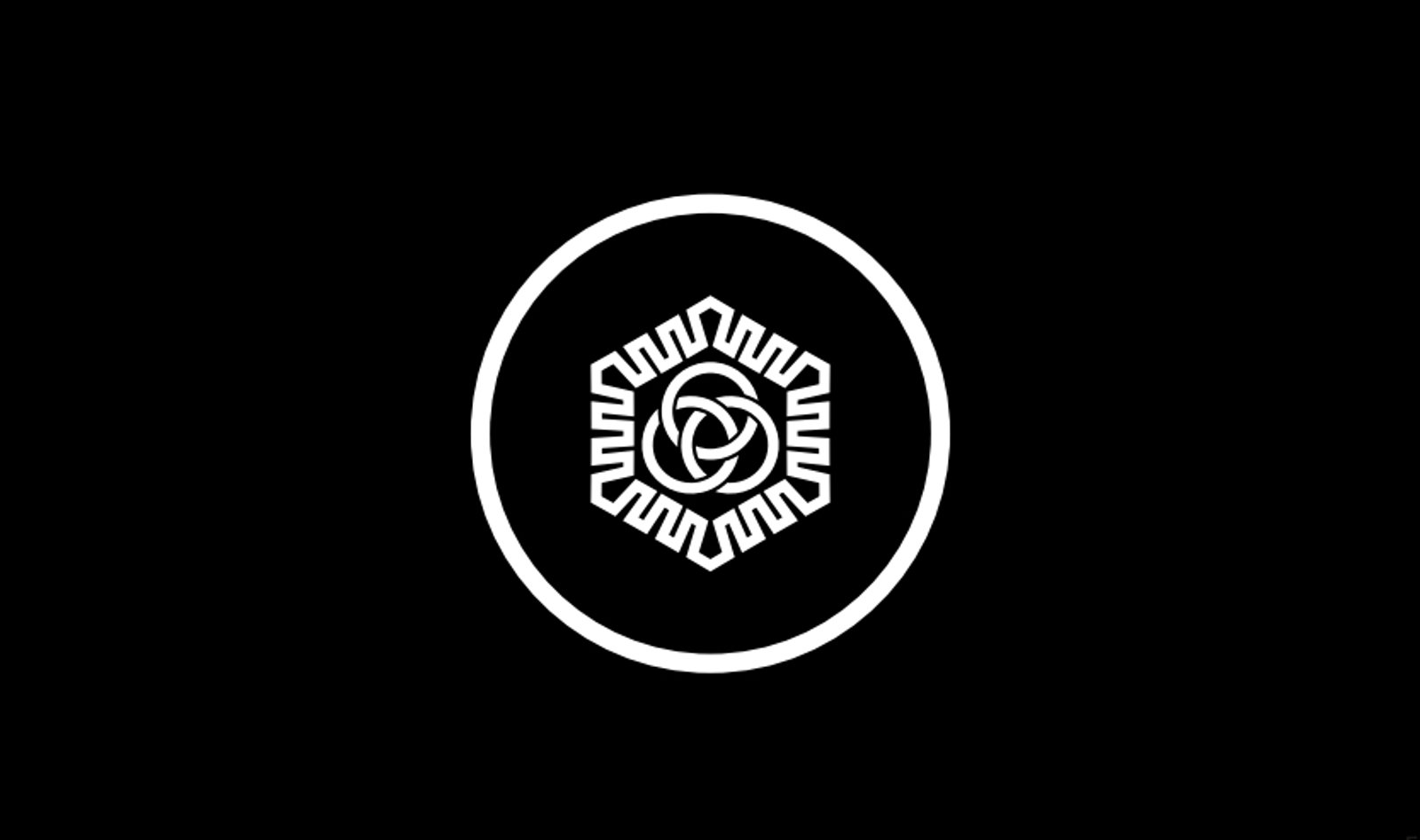
This is the T-Wabisato kamon
Symbolic Description T-Wabisato Crest ‒ The Shape of Borderless Wisdom.
The Hatobas explains, ‘This contemporary emblem fuses the philosophies of Ghana, Norway, and Japan into a visual form that reflects a life guided by transformation, harmony, and creativity. It is not merely a design, it is a meditation in form, expressing a worldview that transcends cultural boundaries.’
Drawn with 110 Circles- No Straight Lines
This crest is composed entirely of circles 110 in total with no straight lines. The use of only curves symbolises fluidity, continuity, and boundless connection. The interlinked circular structure represents how identities, cultures, and times are woven together without edges or interruptions. A visual expression of the Wabisato ideal: quiet strength through openness.
Outer Circle
The outer ring represents eternity, inclusion, and the cycle of life. It is a space that welcomes all, embracing difference while maintaining center.
Outer Margin (White Space)
The intentional space between the central motif and the outer ring represents openness̶room to welcome others, embrace new cultures, and maintain inner calm.
Hexagonal Frame
Kikkō × Nkyinkyim
The outer hexagon structure blends the Japanese kikkō (tortoise shell) pattern with the Ghanaian Adinkra symbol Nkyinkyim, which stands for lifeʼ s journey, adaptability, and creative movement. This merging evokes wisdom, longevity, and flexible resilience across generations and geographies.
Three Interlocked Circles
At the heart of the design, three interwoven rings represent the tri-cultural roots: Ghana, Norway, and Japan. Rather than fusing into uniformity, these rings retain their form while engaging one another, expressing equity, dialogue, and generative coexistence.
It is a symbol of a new centre born from respectful intersection, the living essence of T-Wabisato.